After leaving The Verge which he co-founded with few other great people, and after being personally fired by Michael Rubens Bloomberg, founder & CEO of Bloomberg L.P., Joshua Topolsky recently launched a new website called The Outline. A new kind of publication as they say with a very noticeable twist in the design department like nothing you’ve ever seen before.
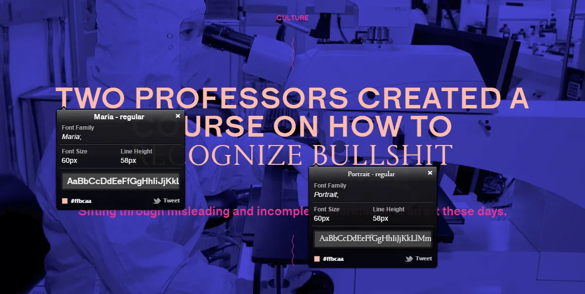
If you visit The Outline (and you really should) you will notice right away how daring their design is. Different typefaces, colors, and layout for each and every article. Heck, there are articles with multiple typefaces for each of their titles, like this one.
We’ve been able to make these things because we’ve formed an incredible new team from scratch. Devs that speak the language of editorial, writers who understand code, video producers who embrace interactivity, designers who are invested in the practice of journalism.”
- Joshua Topolsky
There are many cool details about the site like the UFO sharing button, and the ads which are displayed as cards that you can flip through with your fingers on mobile devices. They are seamlessly integrated with the design in a way that won’t bother you as a reader, like Canvas ads which were introduced by The Next Web.
How you can put the article you are currently reading on the side while you continue browsing the site just by pressing on their logo on the top left corner. And swiping on the article itself left and right on mobile, take you to the next and previous article. It’s like web-based Flipboard.
But my favorite cool design idea about the site has to be: Wiggle Wiggle Wiggle
What I’m talking about is their links CSS text-decoration.
They have this amazing looking wiggly line which looks very similar to the wavy non-animated text-decoration style which is only supported now in Firefox.
The Outline is using a different technique to achieve the same wavy style. SVG with CSS animation inside the SVG code itself.
And to make it as underline, they are using Background-image property which is supported in basically almost everywhere.
Can I Use background-img-opts?
Here’s the raw SVG code:
data:image/svg+xml;charset=utf8,<svg id="Squiggle-svg" xmlns="http://www.w3.org/2000/svg" xmlns:xlink="http://www.w3.org/1999/xlink" xmlns:ev="http://www.w3.org/2001/xml-events" viewBox="0 0 20 4" version="1.1"> <style type="text/css"> .st0 { animation: shift 0.3s linear infinite; } @keyframes shift { from { transform: translateX(0); } to { transform: translateX(-20px); } } </style> <path fill="none" stroke="%23f00" stroke-width="1" class="st0" d="M0,3.5 c 5,0,5,-3,10,-3 s 5,3,10,3 c 5,0,5,-3,10,-3 s 5,3,10,3" /></svg># Let’s break the SVG code down a bit:
First off is the CSS animation, which in this case is included inside the code instead of having it in the site’s stylesheet which I find really interesting.
The animation is linear, with .3s speed which you can change if you want.
.st0 { animation: shift 0.3s linear infinite;}@keyframes shift { from { transform: translateX(0); } to { transform: translateX(-20px); }} Fill is the white space below each bump. Stroke is the color of the line, which in my case I’ve set to %23F00. The Stroke-width is the thickness of the line.
Class is used so you can target the line with a CSS animation, and d is a string which contains the path.
<path fill="none" stroke="%23F00" stroke-width="1" class="st0" d="M0,3.5 c 5,0,5,-3,10,-3 s 5,3,10,3 c 5,0,5,-3,10,-3 s 5,3,10,3"/># Demo
Putting it to use is easy, all you have to do is target your links using <a> tag in CSS, and add the SVG to it on :hover as a background-image as we mentioned above.
You can also change the position and the size of the SVG as your heart desires, till you see that it looks perfect on your site.
In the example code below, we are targeting the link to my site, and the wiggle animation will appear when you hover over the link:
a:hover { background-image: url("data:image/svg+xml;charset=utf8,<svg id='Squiggle-svg' xmlns='http://www.w3.org/2000/svg' xmlns:xlink='http://www.w3.org/1999/xlink' xmlns:ev='http://www.w3.org/2001/xml-events' viewBox='0 0 20 4'><style type='text/css'%3E.st0{animation:shift .3s linear infinite;}@keyframes shift {from {transform:translateX(0);}to {transform:translateX(-20px);}}%3C/style><path fill='none' stroke='%23f00' stroke-width='1' class='st0' d='M0,3.5 c 5,0,5,-3,10,-3 s 5,3,10,3 c 5,0,5,-3,10,-3 s 5,3,10,3'/></svg>"); background-position: 0 23px; background-size: auto 3px; background-repeat: repeat-x; padding-bottom: 3px; text-decoration: none;}# Conclusion
We visit tons of websites every day, each has a different idea for Text Decoration. Whether by changing the color, or whether an underline appears or disappears when you hover the mouse over a link. And many other ideas if you count border-bottom Property which works much better than Text Decoration underline if you ask me.
It seems like The Outline developers who made this didn’t think that these two options were good enough (which is a great thing because it makes us look for new, better ways of doing things) so they combined SVG + CSS and Background-image property to bring us a new way of styling links.
I really enjoy looking for cool new ideas and techniques on sites I visit each and every day. Because I learn a lot from them and I can’t wait for the next thing.
Until then: wiggle wiggle wiggle.